What’s Hot in Store Design? Store Design Trends Around the Globe
Take a fresh look at your location’s design and how it is tied into all channels of communication you use—print, social media, etc.
Tip: “Copper touches on a white backdrop, with grey furniture accents and wood flooring can make a store feel luxurious and modern.”
Hi-Tech
Brands need to integrate digital and brick-and-mortar strategies, not just to avoid “showrooming” (looking in-store but buying online), but also to be consistent across all channels. One brand that’s ahead of the pack when it comes to creating an 020 (online-to-offline) strategy is Burberry.
Pop Ups
Pop-up store designs are a great way to create buzz. According to the VSMD article, “This is achieved by implementing very conceptual or creative, eye-catching design elements that are sometimes not practical for retail stores.” They’re also a cost-efficient way to test a new location or product.
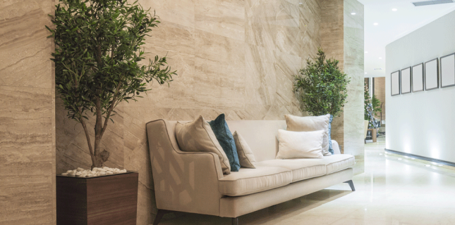
Back to Nature
Brands such as Aesop and Starbucks have made authenticity the key in their store designs. The trend includes implementing a natural theme, natural textures, and sustainable materials.
Futuristic Look
To stand out, retailers are including fresh shapes such as streamlined or curved custom fixtures and display cabinets. Examples of this trend include displays for Alexander McQueen and Stuart Weitzman.
Mixing Materials & Styles
Brands are increasingly launching store concepts that include an eccentric mix of materials not usually seen together. One example is Kiehl’s, whose look combines industrial (brick wall and neon), premium (chandeliers and marble), natural (wood displays) and clinical (sales team in uniform and almost clinical packaging).
Local Elements
Adding local elements adds context to the location with local customer acceptance. In China, for example, a local take in global operations includes Chinese stools, display screens, ancient door elements, and ceramics.
Warm Palettes
Marsala, this year’s color of the year, is great in combination with other warm tones like olive, gray, and taupe. Generally, gray will make any location look more high-end. That’s a big change from the years of combining white light and white walls with other cool colors.
The New Metal
Copper is gradually replacing gold or silver. “Copper touches on a white backdrop, with grey furniture accents and wood flooring can make a store feel luxurious and modern,” reports the VMSD article.
Marble Look
“Many luxury brands are using artistic painting techniques to create a marble pattern effect on walls, floor tiles, and even counter surfaces,” according to the magazine. “Retailers on a budget can use real marble on just a few selected surfaces” to obtain this effect.
Industrial Chic
Getting back to basics “with monochrome colors, exposed steel beams, big windows, and concrete flooring creates a sense of depth and communicates authenticity,” concludes VMSD. The industrial look also helps actual product pop.
What new trends have you adopted in your own location? Let us know and join the conversation about visual merchandising and store design on our Facebook page here.
Reference: www.vmsd.com


Erinn Morgan
Comments are closed.