Pick and play up this season’s unisex palette
Knowing what new colors to add to your inventory mix isn’t as challenging as it may sound. You already know the preferences of many patients, but that doesn’t mean you don’t need to show them what’s hot.
Tip: “Brights against white for summer make clients feel happy, while deeper shades mixed with neutrals for fall make them feel chic and sultry.”
How? By speaking with reps, of course, but also by looking at the experts like Pantone Color Institute to find out what’s big right now…that is, for spring and summer 2016.
The point? To add a pop here and there—both in frames you display and in props and accessories you feature.
To help, here’s a look at what the color gurus at Pantone are reporting, plus what a few style leaders say about how they’re interpreting those colors.
According to Pantone, “With Cuba and other destinations south of the border top of mind, designers are playing with courageous color statements that aren’t afraid to be vibrant but at the same time are combined with quieting and more natural tones.”
One big change from most other years? There is no perceptible difference in color preferences between men and women. Here are some of the shades for which both sexes are showing a strong liking.
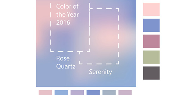
TRENDING COLORS
- ROSE QUARTZ. Pantone likens this top color to a serene sunset or budding flower.
- PEACH ECHO. It’s friendlier and more playful than the oranges that have been popular for the last several years.
- SERENITY. What’s called a “transcendent blue,” it’s airy and encourages escape.
- SNORKEL BLUE. Though in the navy family, it’s more energetic and happier than traditional navies.
- BUTTERCUP. It offers a contrast to other top colors, and designers say it transports wearers to a sunnier spot.
OPINION LEADERS
Pantone asked several style leaders to talk about how they use color to impart mood and emotion.
- Rina Stone of InStyle Magazine says she uses color “in unexpected pairings to evoke a level of excitement. The right combination can elevate mood or cause calm.”
- Ken Downing, fashion director at Neiman Marcus, explains that color attracts. “It excites and ignites the imagination. Color gives immediate credit, providing…relevance.”
- Dallas Shaw, fashion illustrator, explains, “Telling a story is my job. Brights against white for summer make my clients feel happy, while deeper shades mixed with neutrals for fall make them feel chic and sultry.”
What color changes do you see in both product and consumer preference? Join in our Facebook conversation here.


Erinn Morgan
Comments are closed.