Hot off the Palette
Every season, The Pantone Color Institute reports on the colors of the moment. The Institute is a forecasting and consulting arm of Pantone, reporting and advising on color trends. As such, it’s considered a merchandising bible by companies around the world.
Knowing what’s hot, new, and next can also help you and your staff with product selection as well as visual merchandising.
Here’s an insider peek into some of the standouts—five for Fall/Winter 2021 and five more for Spring/Summer. Whether it’s reflected in new product you purchase or your merchandising in-store, try adding a few of those top tones of the season to your location.
It could be a display of sunwear in seasonal colors or a pop of a top shade in-store…in the window, on the frameboard, or even in a pillow or changeable chair covering. Most important, be sure your dispensing staff can communicate the colors that are new, now, and next to customers.
Tip: Be sure your dispensing staff is conversant with the colors that are new, now, and next.
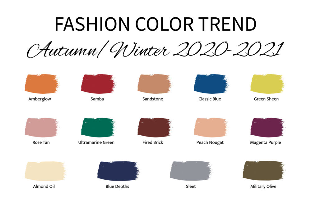
Fall/Winter
“Reflecting a ‘less is more’ mindset that is becoming increasingly important to consumers prioritizing value and functionality, our color palette is stripped of excess,” says Leatrice Eiseman, Executive Director of the Pantone Color Institute. The result is rich and saturated shades and strong pastels. Top tones, as described by Pantone, include:
• AMBERGLOW: “A radiant autumnal orange, Amberglow promotes self-confidence and creative self-expression.”
• SAMBA: “A voluptuous sultry red, Samba introduces an upbeat energy.”
• SANDSTONE: “Tied to nature, earthy Sandstone speaks of the rustic outdoors.”
• CLASSIC BLUE: “A boundless blue hue, Classic Blue is evocative of the vast and infinite evening sky.
• GREEN SHEEN: “Optimistically rebellious, Green Sheen is a bold acidic yellow-green shade that will always stand out.”
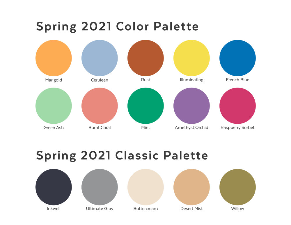
Spring/Summer 2021
For Spring, Eiseman says key colors are uplifting and authentic. “Offering a range of shades illustrative of nature, colors for Spring/Summer 2021 underscore our desire for flexible color that works year-round [and is] infused with a genuine authenticity that continues to be increasingly important.”
Key colors include:
• MARIGOLD: “A comforting golden orange-infused yellow lends a warming presence.”
• CERULEAN: “The color of the sky on a serene, crystal-clear day.”
• RUST: “An earth-inspired brown emblematic of Autumn leaves…uncharacteristic of a spring palette.”
• ILLUMINATING: “Friendly and joyful, an optimistic yellow offering the promise of a sunny day.”
• FRENCH BLUE: “A stirring blue hue that awakens a vision of Paris in the springtime.”
To learn more about these colors of the seasons, go to pantone.com.
Have you already brought in any new colors to freshen your look? If so, tell us how you’ve added dashes to make splashes and join in the conversation on Facebook here.


Erinn Morgan
Comments are closed.