Hot Colors for Spring 2016
Pantone Color Institute, the bible of all things color, has just released its Spring 2016 Fashion Color Report. Following are key trends, including hot colors for spring, designer takes, and what it all means. The point? You’re in optical, yes, but glasses are increasingly considered a major fashion accessory. And, that is good news.
Tip: Consider the year’s top colors in your buying, but also add pops of them as backdrops or props in displays
Here are six things you need to know to put key colors trends to work for you and your business in 2016.
- Color of the Year
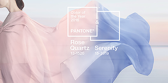
It’s a softer take for 2016, with Rose Quartz (Pantone 13-1520) and Serenity (Pantone 15-3919) taking top honors. This is the first time Pantone has blended two shades to be chosen as the Color of the Year.
- Connection
According to Leatrice Eiseman, executive director of the Pantone Color Institute, “Joined together, they demonstrate an inherent balance between a warmer, embracing rose tone and a cooler, tranquil blue, reflecting connection and wellness as well as a soothing sense of order and peace.“
- Fashion
“This spring,” reports Eiseman, “designers were inspired by the contrast of urban design and lush vegetation, leading to unexpected color combinations and collections, reminiscent of architecture, travel, and nostalgia.”
- Artistic Inspiration
Artists known for their bold and sometimes playful colors—like Matisse and Picasso—have inspired fashion designers to make equally bold color statements this spring, and one that is also gender neutral.
- Designer Picks
Each of the season’s hottest fashion designers has their own color picks, too. For Rebecca Vallance, it combines classic film noir and ‘90s pop culture—blacks, charcoals, pale whites with bold splashes from ‘90s music videos. Nicole Miller is big on black and white as well, but with pops of bright turquoise and raspberry, plus olive drag with burnished lilac and fiery coral. And, for Tadashi Shoji, signature colors of the season include violet, spectra yellow, and sweet lavender…all playing off his Japanese heritage and memories of Japanese gardens.
- Using It
What can you do with this information? Consider it in your frame buying, for sure, and also in sunwear and even lens tints. But, also add pops of key colors for 2016 as backdrops or props in displays, maybe add in a few throw pillows, or purchasing some new art on the walls in the season’s hot tones. Touches of the year’s key colors will tell patients you are, indeed, in the fashion know.
How do you use fashion information like this at your location? Does it impact your buying? Do you share it with dispensers, buyers, plus whoever is responsible for your visual merchandising? Tell us how you show consumers you’re fashion savvy and join the conversation on our Facebook page here.


Erinn Morgan
Comments are closed.