Color Me: 10 cool colors for spring
The most popular colors for Spring 2017 are bright, fun, and cheerful. To help make sure you feature that mix in your location, here are The Pantone Color Institute’s Top 10 picks for spring. They’re based on what fashion designers are featuring in their collections, as first seen at New York Fashion Week. As Pantone describes the trends, “From colors that are bright and vivid to those that convey a sense of earthiness, our top 10 colors for spring are reminiscent of the hues that surround us in nature.” How is that different than some years? According to Pantone’s Executive Director Leatrice Eiseman, “One of the things that we saw this year was a renewed sense of imagination in which color was appearing in a context that was different than traditional ones.”
Tip: From bright and vivid to earthy and transitional, Spring 2017 colors are all reflected in nature.
- NIAGARA-As the most prevalent shade this spring, Niagara is similar to a classic denim blue. It’s considered comfortable as well as dependable, and, according to Pantone, “speaks to our desire for ease and relaxation.”
- PRIMROSE YELLOW-While Niagara is synonymous with relaxation, Primrose Yellow is all about vitality and sunny days.
- LAPIS BLUE-This intense shade of blue suggests even more energy than does Primrose. It’s strong and confident and, as Pantone reports, “is imbued with an inner radiance.”
- FLAME-Flamboyant and fun loving, Flame’s vivacious red-based orange is at once theatrical and HOT.
- ISLAND PARADISE-This cool blue-green shade is reminiscent of tropical settings. It’s a refreshing aqua that makes you feel like unwinding.
- PALE DOGWOOD-Tranquil, quiet, unobtrusive, and peaceful, this subtle soft pink reflects both a healthy glow and an aura of purity.
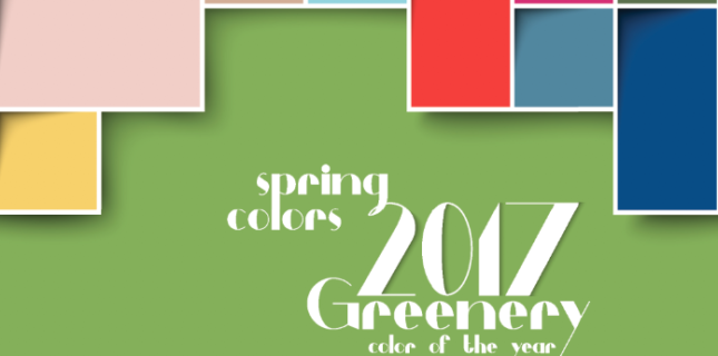
- GREENERY-The #1 color of 2017, Greenery offers a refreshing take on more traditional greens. It’s a tangy yellow-green that is illustrative of flourishing foliage.
- PINK YARROW-Here are just a few of the words that describe this lively color: tropical, festive, whimsical, tempting, and tantalizing. As Pantone describes it, “Bold, attention-getting, and tempestuous, the lively Pink Yarrow is a captivating and stimulating color that lifts spirits.”
- KALE-Another foliage-like green, Kale suggests a healthy lifestyle and need to connect to nature. A natural green, Pantone reports that Kale “provides the perfect complementary background to the more vibrant tones in the palette.”
- HAZELNUT-Like Kale, Hazelnut “plays well with others.” It’s considered by Pantone to be “a key neutral for spring and a transitional color that effortlessly connects the seasons.” Its natural earthy feel is as once warm and unpretentious.
There are lots of ways to pull these Big Ten tones into your location—through eyewear itself, as a backdrop to spring displays, in the occasional accessory, and even in color swatches that tell the tale of the spring season.
How do you tell the color story in your practice? Tell us about it and join in the Facebook conversation here.


Erinn Morgan
Comments are closed.