Visual Merchandising: Frame Board Basics
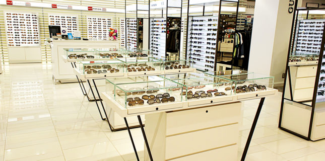
Every location has them, and they’re one of the biggest merchandising challenges there is. Regardless, research backs up the importance of making sure those frame boards pop.
Tip: “Just because you displayed the complete collection in one place on your frame board doesn’t mean you shouldn’t repeat strong sellers elsewhere.”
STIMULATE SHOPPING
According to The International Journal of Engineering Science and Innovative Technology, 80% of customers surveyed feel that “good interiors and store design” affect their buying behavior and stimulate them to shop more. Only 7% report displays and in-store signage have no impact on purchasing.
NINE OUT OF TEN
That means you need to carry your message from front to back, side to side. While a big trend in new-dispensary design is no frame boards, more than 80% of ECPs have at least one area of frame boards. The good news is the boards don’t have to look like a holdover from the 1950s, though the truth is way too many do.
Here are a few tricks to bring your boards up to the 21st century, while giving consumers good reasons to pause, peruse, and purchase.
KILL CLUTTER
Professional visual merchandisers always say that when you think you’re done with a display, stand back and then take one thing away. In other words, simplify just a bit more, even if you think it was already perfect. Less, as they say, is definitely more when it comes to frame board displays.
Clutter will definitely kill consumer interest in your board. So don’t fill every space with frames. Create a pattern where you leave some open, or replace the equivalent of a rectangle of board space with a photo, an accessory, or better yet a mirror.
MIRROR, MIRROR
A common criticism raised by retail consultants is that optical doesn’t offer consumers enough mirrors and viewing options. So, take some of that board space and insert mirrors at more than one height, since some customers are 5’1” and others are a good foot taller.
Better yet, install at least one full-length mirror in a prominent position because people don’t just want to see how their face looks in eyewear, but how those frames go with their whole outfit—that is, their look from head to toe.
TELL A STORY
Don’t display one-offs. Show off a complete collection together—including sun, higher-style/evening, and everyday. Add props, even nicely framed vendor POP, to tell the brand story. If it’s a well known fashion or sport brand, add other products from that brand—a great scarf or necklace and, in the case of sports, have some fun and add a tennis racquet or golf accessory to tell the sports story.
REPEAT YOURSELF
Just because you displayed the complete collection in one place on your frame board doesn’t mean you shouldn’t repeat strong sellers elsewhere. If it’s a super pair of sunglasses, add it to your higher-end sunglass display elsewhere in your location. Or, if you have an area where you’re displaying by color, add some from that best-selling line to that grouping, too.
Many ECPs will display a product they really believe in two or three times. How you surround and merchandise it can help you tell several different stories.
So, be creative, reinforce your message with strong displays and, above all, have fun.
If you’ve done just that, or have questions about how to move forward, please share in the conversation about visual merchandising and frame boards on Facebook here.
Comments are closed.


