What’s Styling?
It’s still Fall, but in the design world, the focus is already on Spring/Summer 2019. The same goes for eyewear fashion trend watcher Eyecessorize.com, not to mention the patients in your practice who keep an eye on what’s on trend. To help you talk the talk, here’s a look at several fashion and color trends that dominated the recent S/S ’19 Fashion Weeks’ catwalks.
Tip: Look for mesmerizing mirrors and tints—especially in “faint greens, icy silvers, creamy lilacs, and jaw-dropping ambers”
TOP EYEWEAR TRENDS FROM EYECESSORIZE
Here are some of Eyecessorize.com’s favorite looks from the runways in London, Milan, New York, and Paris for S/S ‘19.
- KILLER COLORS: Reds (both exotic and fiery), blues (especially electric tones), soft pinks and frosted whites, bright yellows and deep purples.
- ALL IN THE DETAILS: Flowers (oversized and lush), decorative patterns and subtle, delicate jewels, two-toned metallic looks, decorative and eye-catching patterns, metallic two-toned and layered effects, plus futuristic browlines.
- LUSCIOUS LENSES: Mesmerizing mirrors and tints—especially in “faint greens, icy silvers, creamy lilacs, and jaw-dropping ambers,” reports Eyecessorize. Not to be outdone, gradient effects remain consumer favorites as well.
- DRAMATIC SHAPES: Looks range from minimalist rounds and ovals to square silhouettes. Popular shapes also include a mix of everything from super modern shield-inspired looks to fun butterfly ones.
FRESH COLORS FROM PANTONE
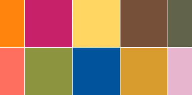
Fashion’s color gurus at the Pantone Color Institute just released their color trend report for S/S 2019. Here are 12 stand-out looks based on what fashion designers are already featuring in their collections for Spring/Summer 2019:

Top colors for spring/summer 2019
12 TOP TONES…
- FIESTA: An orange-red festive color that exudes excitement
- JESTER RED: Rich, elegant, and intense
- TUMERIC: A pungent and enlivened orange
- LIVING CORAL: Golden undertones soften this animating shade
- PINK PEACOCK: Both theatrical and tantalizing
- PEPPER STEM: Zesty tones of yellow and green
- ASPEN GOLD: Sunny and super cheerful
- PRINCESS BLUE: A royal and glistening royal blue
- TOFFEE: Delicious enough to whet the appetite
- MANGO MOJITO: A golden yellow that exudes comfort
- TERRARIUM MOSS: Harkens thoughts of flourishing foliage
- SWEET LILAC: A soft, gentle pink-infused lavender
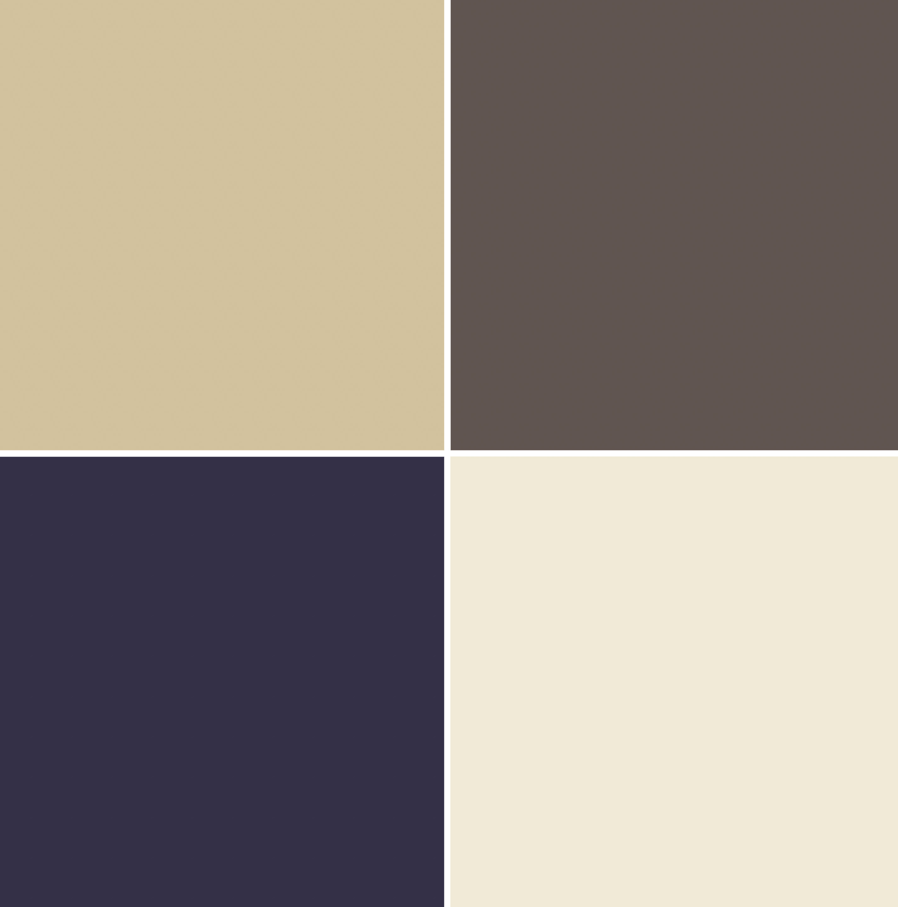
4 WINNING NEUTRALS…
Super colors, super looks. But what about neutrals? Pantone points to great potential for color contrast…in fashion, and in eyewear, too, with:
- SOYBEAN: Subtle and versatile
- ECLIPSE: Reminiscent of the midnight sky
- CORN: Buttery and soft
- BROWN GRANITE: understated, authentic, and strong

The new neutrals
This is excellent information to have on hand in the office and especially for dispensers to review. It might be good fodder for social media as well, underscoring the fact that you are up with the latest and hottest trends. Go to pantone.com, for the actual color numbers of each shade.
Tell us how you might share this information in your practice and join in the Facebook conversation here.
Comments are closed.


