Hot Colors + Trending Tones
Get out that can of paint. Two years ago, gray was all the rage for interiors. This year, beige took center stage. So did pastels. For 2024, however, interior designers say it’s going to be about darker shades of everything. Last year it was light green, for example. Next year will be olive’s turn. Fortunately, just painting a few accent pieces in today’s tones, or even adding fabric to a display, is enough to show consumers you’re with it.
Tip: The autumn/winter season palettes open the door to “free, fun, and inclusive color imaginings.”
Color Gurus
When it comes to inventory, however, it’s not nearly as easy. Plus, if you buy wrong, it’s definitely a lot more expensive than the price of a can of paint.
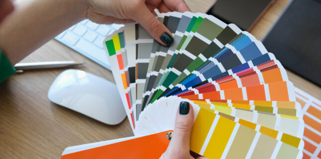
The top 10 tones encourage exploration and experimentation.
To help, here’s a look at what the color gurus at Pantone Color Institute report are in store for Fall 2023 and Winter 2024.
As seen at New York Fashion Week, “Colors for Autumn/Winter 2023/2024 NYFW reach out beyond what we think is possible to catapult us into this new era,” says Leatrice Eiseman, executive director of the Pantone Color Institute. The direction? It will be “taking us to a place where boundaries of time, place, and identity are no longer fixed,” she adds.
10 Tones
The season’s palettes encourage exploration and experimentation, opening the door to “free, fun, and inclusive color imaginings,” explains Pantone. Those palettes include these top 10 tones:
• Tender Peach: “Gentle Peach invites a soft, easy touch.” PANTONE 12-0912 TCX.
• Rose Violet: “A tantalizing fuchsia radiates high energy.” PANTONE 17-2624 TCX.
• Viva Magenta: “An animated red encouraging experimentation and self-expression.” PANTONE 18-1750 TCX.
• Red Orange: “A heated gregarious tone, both spontaneous and self-assured.” PANTONE 17-1464 YCX.
• Red Dahlia: “Imposing…elegance personified.” PANTONE 19-1555 TCX.
• High Visibility: “Exuding the warmth and splendor of the sun…expresses joy and good cheer.” PANTONE 13-0751 TCX.
• Persian Jewel: “A blue hue inspired by the previous lapis lazuli mineral stone.” PANTONE 17-3935 TCX.
• Carnival Glass: “A mentholated green with an icy appearance.” PANTONE 13-6030 TSX.
• Burnt Sienna: “Sturdy and steady…conveying a sophisticated earthiness.” PANTONE 17-1544 TCX.
• Kohlrabi: “Tasty green…adds a dash of piquancy.” PANTONE 14-0255 TSX.
What colors are you adding in both product and store decor this winter? Tell us about it and share in the conversation on Facebook here.


Erinn Morgan
Comments are closed.