Cool colors/Hot trends
You’re probably thinking back-to-school 2019. Color forecasters, on the other hand, are already talking about hot colors for 2021. While you’re likely not planning that far out, it’s important to know a bit about what’s now and next. And, most important, to consider that information in both your buying and your conversations with customers.
Here are a few key trends.
SEEING IT
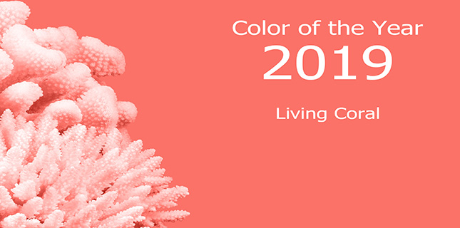
• COLORS OF THE YEAR. The king of color forecasting, The Pantone Color Institute, calls Living Coral THE color for 2019. Last year it was Ultra Violet Purple.
• 2019. While coral is tops, Pantone also points to runway color trends in different fashion capitols. In New York, spicy reds share the stage with a palette that includes lively coral and peachy pink. In London, it’s orangey-reds combined with other must-haves that include butterscotch, moss, and merlot.
• 2020. WGSN, the trend forecasting firm based in the UK, points to Neo Mint as the directional tone that is showing great demand among trendsetters and early adopters. According to WGSN Insider, “Neo Mint…heralds the start of a new decade, embodying an optimistic mood when advances in tech and science will take hold.”
Other top tones for 2020, according to WGSN: Purist Blue (a softer shade than before); Cassis (a deep combo of purple and pink); Cantaloupe (a milky, subdued shade of orange); and Mellow Yellow (a deeper tone that’s in step with the popularity of “earthy, baked hues”).
As for Pantone, it sees for Spring/Summer 2020 a variety of under-the-sea shades, ranging from “cool blue watery shades to the red-hot thermal bed of underwater volcanos.”
• 2021. AI Aqua, an electric blue, is what WGSN predicts will come to the fore in both fashion and interiors for 2021. One big reason? Technology. “If you think of sites like Facebook and Twitter, which we interact with on a daily basis, they all use predominantly blue branding. If we are set to spend even more time with our devices, we are going to have even more exposure to this color,” concludes WGSN.
FEATURING IT
There is a lot you can do with this information.
• BUY. Make sure your frameboards or displays include colors of the season…and call them out as such.
• CHIPS. Get color chips from Pantone. Create a special “trending board” to show them off. Better yet. Add frames nearby in those colors to carry the trend through to purchasing.
• SHOW. Color guru Leatrice Eiseman suggests using color in displays. One simple way? Take a narrow, vertical board, paint or cover it in a top trending color, and place it behind a display area. Then place frames that include that color in that display area as well.
• DESIGN. Feature the color throughout in simple, cost-effective ways. It can be buying a couple of inexpensive tossed pillows in the color of the season you are highlighting, replacing fabric seat covers with hot colors, or even replacing mats in photo frames with trending tones.
• COMMUNICATE. Go to websites like www.pantone.com or wgsn.com and share some of their trending information on social media. And, definitely make sure dispensing staff is up on what’s hot.
• REPEAT. Wherever you feature it, says Eiseman, repeating color is key to making an impact with your messaging.
How do you feature current colors and trending tones at your location? Tell us and share in conversation on Facebook here.


Erinn Morgan
Comments are closed.