Winter Fashion 2017: Colors and Materials
Several fashion houses, plus The Pantone Color Institute, have released their takes on hot colors for winter. Here we bring you a look at top fashion takes and who is spending what.
Tip: “Rescue is the new buzzword replacing recycling. As part of that, handcrafted, raw materials are seeing a resurgence.”
Though spending varies by region, there are many color and fashion trends that are in vogue from sea to shining sea. Here are 10 of the color trends for winter 2017.
- BLACK OR WHITE? Black is referred to as “the pulsating force behind and canvas for other colors.” White, on the other hand, will be seen as both warm and cool, and “is important because of its properties,” not just its color per se.
- GRAY STEPS UP. Grays have regained their foothold in fashion, and eyewear as well, partly because they cross a broad spectrum of hues—including both neutral and warm as well as muted and strong.
- GREEN GROWS. Again, it’s a tale of two tones for 2017. One is yellow toned and olive oil green. The other is cooler, sometimes glassy, and “more mineral.”
- YELLOWS AS ACCENT. Applied to accentuate both texture and surface effects, yellow connotes radiance and pure light, and will used in accents for 2017.
- NAVY SAILS AWAY. Fashion is stepping away from the classic indigo shades that have been so dominant. Replacing them are shades that are infused with green or gray.
- BROWNS CROSS OVER. All browns—from wine-red brown to tan or nutmeg—are important in terms of both material and surface colorations. Oranges will be borrowing from the brown family, as well, with color influences in winter 2017 coming from spices like cinnamon and saffron.
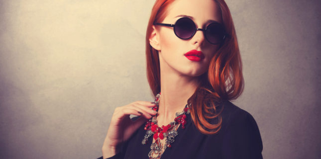
- POP GOES THE…RED. Being used primarily as a pop color, reds are strong and bright. Pastels are taking a similar direction, moving from the neutrals of last season to bright and assertive tones.
- METAL MIX. Metals are more decorative than before, and playing with textures and light to add another dimension to fashion…including eyewear.
- WHERE’S RETRO? According Pantone Executive Director Leatrice Eiseman, “The retro look is not going away. Rescue is the new buzzword replacing recycling. As part of that, handcrafted, raw materials are seeing a resurgence.”
- WHAT DOES IT MEAN? Pantone Vice President Laurie Pressman explains how two over-arching color trends—absence vs. presence and obscuring vs. revealing—reflect what’s going on in U.S. “On the one hand, there is this wish to return to the simple, honest, and unassuming. On the flip side, there is a continuing presence of maximalist and a deep desire to stand out and be seen.”
How do you make sure you and your practice stand out and are seen as fashion forward by consumers? Have you followed the trends and added today’s hot colors to your frame mix? Share what you’ve done and join the conversation on our Facebook page here.
Comments are closed.


